The City has launched a new web tool that puts a wealth of information about Toronto neighbourhoods at your fingertips and lets you manipulate them into useful maps. It’s an ambitious addition to the City’s open data strategy.
Wellbeing Toronto was launched earlier last week, and presents citizens with mappable information separated into categories as diverse as firearms incidents, number of seniors living alone, polluting facilities, and access to childcare. You can view all these statistics individually, or compile up to 20 indicators into a single, layered map that uses colour gradients to show the areas of highest value for the categories you’ve chosen.
If you’re of the geeky persuasion, it would be easy to waste hours toying around with this app. The sheer amount of information it provides is impressive, and the stats can be combined and compared in a nearly infinite amount of ways.
It’s another feather in the cap of the staff at City Hall, who continuously prove that while our mayor may be hard to get through to (nice day for a trip to the cottage, eh?) the goings on at 100 Queen West are easily accessible through RSS feeds, Twitter accounts, and online meeting monitors.
According to the website, the app is aimed at assisting policy-makers in making better-informed decisions, citizens who want to better understand where they live, and business owners needing to plan their operations. But the most positive thing about Wellbeing Toronto is that anyone can hack together the data for their own purpose and create unique maps that portray the city in different ways. It’s easy to envision the app being useful for any number of citizen-driven projects.
You can find the neighbourhood with the highest amount of combined tree cover, green spaces, and city beautification programs (turns out it’s the Rouge valley), or the area with the most crime and poverty (surprisingly, the the Waterfront and Toronto Islands tops those categories). You can also find out if the city’s least diverse neighbourhoods are the richest (they are) and see where the highest incidents of traffic accidents are.
For all its insightful features, the app does have limitations. The value of the raw data is fixed and can’t be inverted, so for instance if you’re trying to find out where the best place to raise kids is you can’t search for the neighbourhood with the least crime and most schools, only the neighbourhood with the most crime and most schools, which is not super useful. Exporting the data to a .pdf takes a while, and it’s best not to use the site during the process because the whole thing slows down and goes a bit haywire.
Also, most of the data isn’t expressed as a per capita or per area value, which makes it difficult to accurately compare neighbourhoods.
I’m no stats whiz (the last time I cracked open a math textbook Clinton was in the White House and a band called Oasis was poised to take North America by storm), but after playing with Wellbeing Toronto for a few days I managed to generate some interesting maps. Here are a few below.
There are many different functions to the app, so before you test-drive it check out this quick tutorial on the city’s website.
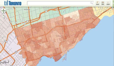
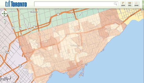
1. The dark areas on the first map show the areas of the highest diversity. The dark areas on the second map show the highest average household income. Notice a pattern?


2. Traffic collisions downtown are concentrated on the Gardiner east of Bathurst, suggesting cars are still hitting each other more than they hit bikes.

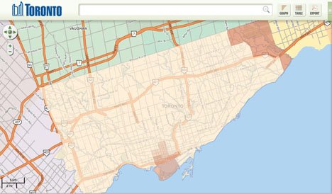
3. This is a composite map of all the negative indicators on Wellbeing, such as crime, poverty, and premature mortality. Surpsingly, the Waterfront Communities and Toronto Islands score the highest for these indicators, suggesting it’s the worst neighbourhood in the city.

4. This is a composite map of all the green spaces, tree cover, and beautification programs in the city. The two prettiest neighbourhoods are the Rouge Valley and the Waterfront, and all other neighbourhoods have about the same amount of green space.


